Video file
a creative marketing agency
Video file
How can we make a difference for you?
We shape smarter communication & activation strategies to ensure success.
Video file
transform complex science to become comprehensive & insightful.
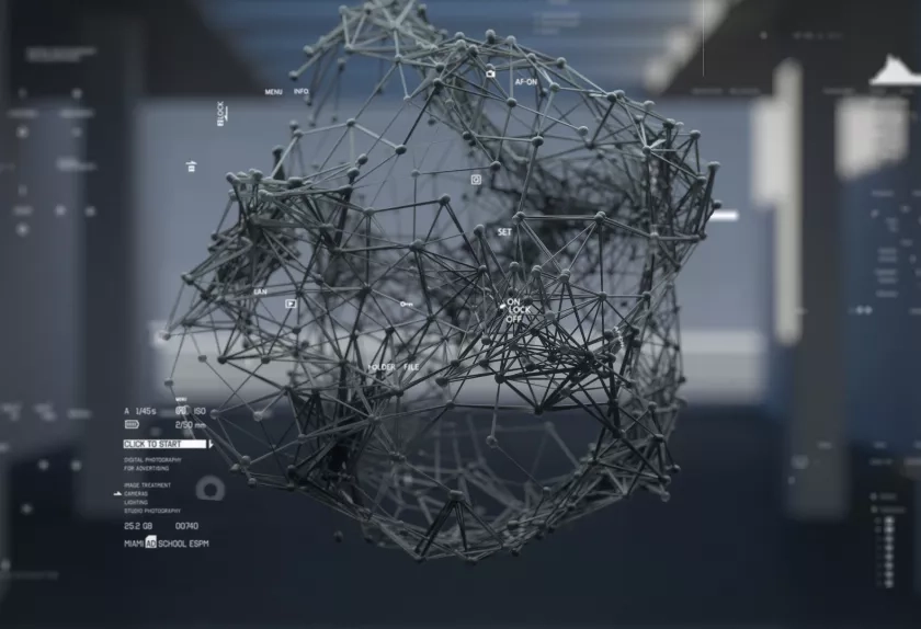
Image
and use your authenticity to make visually unique stories.
Video file
Turning you into the go-to brand of your industry
Our key?
imagination
Our Expertise
Crafting unique brands, campaigns and experiences that spark action and build lasting connections with your audience
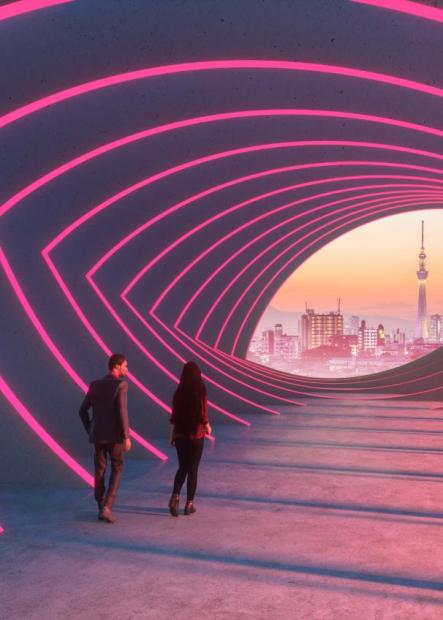
Image
Brand research
Brand strategy
Brand storytelling
Brand identity
Branded content
Employer branding
Video file
Product launch campaigns
Social media marketing
Omni-channel campaigns
Content marketing
Corporate communications
Recruitment campaigns
Video file
Brand experience
Event marketing
Gamification marketing
Virtual Reality marketing
Interactive websites
Point of Sales marketing
Our Focus
Marketing and communications services tailored to the health, food, and tech industries
Video file
Health
Providing healthcare marketing & communication services, supporting the entire health landscape, spanning from research to prevention, and from diagnostics to treatment
Food
Contributing to the foundation of the global food system, our deep-rooted experience in the realm of food ingredients, nutrients, and the beverage market establishes us as a dedicated food marketing agency
Tech
Drawing from over 20 years of expertise in the B2C electronics industry, our focus is shifting to become a dynamic tech marketing agency, dedicated to serving visionary B2B tech companies shaping the world of tomorrow
Sustainability
Cross-industry, as a sustainability marketing agency, we help companies communicate their sustainable vision to market products and services that support a positive change to our world
Using imagination
to touch hearts & minds
Stahl - branding an industry leader
Learn more about Stahl's journey of rebranding, reflecting its evolution from a traditional leather producer to a leader in specialty coatings focused on sustainability. This transformation required a visual identity update to match Stahl's new direction, blending its historical roots with a modern, purpose-driven approach. Through strategic design and thoughtful integration of Stahl's core values, the rebranding effort showcases how innovation and heritage can unite to create a more sustainable and impactful future.

Sakura SmartConnect – welcome S.A.R.A.
Sakura introduces the SmartConnect "Cobolt" arm, advancing histopathology automation to enhance lab efficiency. Amid pandemic challenges, the campaign introduced S.A.R.A. (Sakura's Autonomous Robotic Assistant) to humanize technology. This strategy balances innovation with personal engagement, preserving the human connection while improving processes. The approach not only showcases the arm's benefits but also positions technology as a supportive ally in healthcare.
BD - crafting the story of automated microbiology
In collaboration with BD, we embraced a departure from conventional medical device marketing by introducing emotionally authentic storytelling. This innovative approach not only heightened brand awareness but also set new industry standards for imaginative communication, transforming feature-driven communication into emotional storytelling.
Livanova - revamping a leading brand
Essenz Perfusion System transforms perfusionists into essential contributors for better patient outcomes. Our campaign captures the connection between metrics, technology, and data, unveiling wisdom for optimal surgical conditions. A unique design celebrates revolutionary technology, showcasing Livnova's innovation in healthcare.
Cargill - building chocolate paradise
The Chocolate Experience Centre transforms visitors into chocolate explorers through an immersive journey, offering hands-on learning and innovation opportunities. It empowers them to delve into the world of chocolate, fostering creativity and expertise.
Our Clients
WE LOVE THEM ONE BY ONE


Careers
Creative strategist
Amsterdam
Full time
Senior creative
Boston
Full time
Creative designer
Amsterdam
Full time